UI/UX Design
Papelex
Overview
Papelex was created 28 years ago with one purpose: to offer optimized solutions to its customers. With this in mind, it brings together in one place all the supplies needed to make its customers' daily lives easier. With a wide variety of products and seeking to guarantee the lowest prices and the best quality, Papelex has market-leading partners such as: 3M, Pimaco, Bic, Multilaser, Dello, OEX, among others. Papelex is also an official distributor of HP, Lexmark and Chamex products, making it possible to negotiate the best prices on the market.
My Role
UX Designer, UI Designer, UX Researcher
Period
2020 – 2021
The objective
Migrating to the VTEX IO platform, the main objective of the project was to take advantage of the transition to update and optimize the layout of the site in both its desktop and mobile versions.
The challenge
As it is a well-established brand in the market, the main challenge was to promote relevant updates to the e-commerce layout, bringing important innovations and new page layout proposals, while at the same time avoiding any distancing from the company's current identity. One of the main challenges in this regard was managing a large number of visual elements (due to the wide range of products and partner brands) so that the content was well organized and understandable.

Discovery Phase
During this stage, the first meetings were held with the client, and the team organized itself to start the research and gather important data to feed into the creation of the new layout. In order to establish references for the project, there were two main stages in the discovery phase: visiting the physical store and benchmarking competing stores. Both stages were very important for gathering input that contributed greatly to both the construction of the site's information architecture (Sitemap design) and the first visual directions for the new layout.
Visiting the physical store
The visit to Papelex's physical store (located in Barra da Tijuca, Rio de Janeiro) took place at the end of 2020. The creative team visited the store, as did the professional responsible for information architecture.
Lasting about an hour, the visit brought important insights into ways of applying the brand's visual identity, as well as providing an important view of how the products are organized and categorized in the physical store. What follows is one of my main contributions to the research during the visit: the mapping of the store.
During the visit, I drew a plan view of the store in order to map it out. The structure of this mapping consisted of two views: the map itself (image on the right), and the product listing. The map view consists of:
The illustrated gondolas and showcases were classified into rows and columns; Each row had a number (from 1 to 3), and each column a number (from 1 to 11); Each gondola was identified with a code consisting of the row and column (e.g. gondola 2.6, highlighted in pink on the map, is in row 2 and column 6).

Mapa da loja física
Special showcases were also mapped:
As localizadas na frente de loja (classificadas de V1 a V7, destacadas em amarelo no mapa);
Gondolas that were in a different arrangement at the bottom right of the map (classified from 1H to 6H, highlighted in green on the map).
In the product listing view, the codes were listed and the team recorded the types of products on the shelves for each one. At the end of this mapping, it was possible to observe the distribution logic of the products more precisely, which was important for categorizing them, and for structuring the information architecture and creating the menu for the digital store.


Benchmarking
After the visit to the physical store, we moved on to the next stage of the research: the benchmarking study of competing stores pointed out by the client in ideation meetings. Three competitor websites were analyzed (Kalunga, Oceano B2B and Staples), and some elements of the websites were used as parameters for comparison in the study. The main ones were:
- Homepage elements
- Header/Menu
- Product page
- Minicart
- Subscriptions page

Definition Phase
At this stage of the project, all the data collected began to be applied to the new layout. Initially, the main elements of the project (color palette, typeface, button and input styles, etc.) were organized and stored in the style guide. From there, the first wireframes were created to validate the functionalities appropriate to the scope of the project with the development team, who would be responsible for giving technical approval on the viability of these functionalities.
With the development team's approval, concept pieces were created. These not only served to validate the functionalities with the client, but also had the purpose of seeking approval for the "look & feel" of the project, trying to ensure that the visual aspect and feeling conveyed by the layout were in line with the client's expectations.
Once the first layout in the concept pieces had been approved, the rest of the UI Design stage began, using the Style Guide to create the rest of the pages, always seeking to adapt the layouts to the principles of responsiveness.

Sitemap

Color palette

Components library
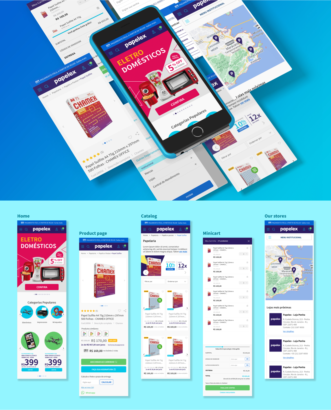
Layout

Layout mobile

results and conclusions
The research and component definition stages revealed some very interesting findings, allowing us to create innovative components for the page that are still present today. This was the first project I led when I joined the agency, and I was pleased with its development and the results obtained.
Throughout the project, I gained a lot of knowledge, and communicating with the client presented some serious challenges. Nonetheless, I believed the outcome was satisfactory. The design of Papelex's online store, which is still operational, was largely inspired by the ideas generated during this project.
Other Projects

Ratatapp
FATEC Senac Rio

Clube do Sorvete
Original.io

VTEX Template Store
Original.io

Dashboard Atmos
Cepel / AXIA Energia (Projeto Atmos)