UI/UX Design
Meteorological Monitoring Dashboard
Overview
The Meteorological Monitoring Dashboard is one of the products within an internal portal of a Meteorological Monitoring and Intelligence Center, an initiative focused on the analysis and monitoring of weather events with direct impact on the operation and maintenance of assets in the energy sector.
My Role
UX Researcher e Product Designer
Period
2024 – 2026
Context
The Meteorological Monitoring Dashboard was initially developed without the involvement of UX Design, due to time and planning constraints. In its original conception, the tool was not intended to be a final product, but rather an exploratory prototype. However, the outcome exceeded stakeholder expectations and began to be used as a definitive solution, highlighting the need for a more structured UX approach to support the product’s evolution and related solutions.
In this context, this project marked the beginning of the formal application of UX Design within the initiative, with the Dashboard being the first product to receive a dedicated, user-centered approach.
Users and purpose of the product
The Meteorological Monitoring Dashboard is a solution used by operations analysts with higher education backgrounds, responsible for assets within one of the leading companies in the energy sector.
Its main objective is to support operational decision-making through the predictive analysis of moderate and severe weather events.
By identifying assets under their responsibility within areas affected by critical events, users gain relevant insights to support strategic decisions related to operations and maintenance.
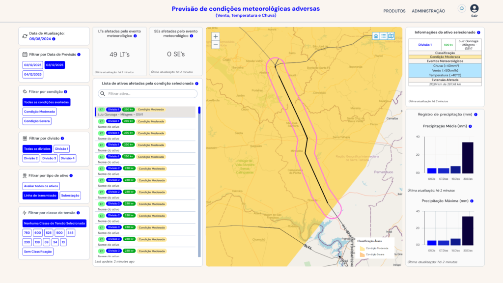
Visão geral do Dashboard, produto voltado à análise preditiva de eventos meteorológicos para apoio à decisão operacional.
My role in the project
This was my first project within the context of the Meteorological Monitoring and Intelligence Center, where I took on the responsibility of introducing structured UX practices into a product already in use.
I worked as the UX Designer responsible for the Dashboard, being the sole UX professional dedicated to the initiative. I independently led the first structured introduction of UX Design into the project, establishing processes for analysis, user validation, and experience guidelines. My role extended beyond interface improvements, contributing to the creation of a methodological foundation that began to guide product decisions and influence the development of subsequent solutions.
My performance was end-to-end, encompassing:
- Immersion in the product and understanding of existing workflows.
- Continuous alignment with stakeholders and the development team.
- Support with initial interface adjustments.
- Defining the test tasks
- Planning, conducting, and analyzing usability tests
- Consolidation of UX recommendations and support for implementation
Challenges and restrictions
UX efforts began in a context marked by significant structural challenges. The Dashboard was already in use, and there was no documented history of experience-related decisions, requiring a reconstruction of context and a clear understanding of prior choices made during development.
In this scenario, there were also no established research or user validation processes, which demanded the creation of a UX approach almost from scratch. At the same time, the instability of the data environment limited testing with real-time information, requiring adaptations in how sessions were planned and conducted.
In addition, technical constraints and the development team’s availability made it essential to carefully prioritize recommendations, balancing usability improvements with their impact on operations. These factors guided an approach focused on delivering incremental value while ensuring feasibility within the existing constraints.
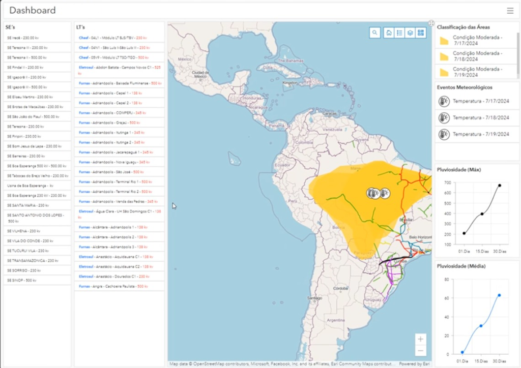
First version of the Dashboard when I started working on the project, developed without UX input.
UX Process
Immersion and alignment
The immersion and alignment phase marked the beginning of UX efforts on the Dashboard and was essential to building a solid understanding of the product and its usage context. Initial meetings with stakeholders and the technical team helped align expectations and structure the working approach, focusing on gathering relevant information to support the product’s evolution.
Since the Dashboard was already in use and there was no formal documentation of prior decisions, it was necessary to reconstruct the product’s context, including its navigation flows, business rules, and technical constraints. Throughout this process, I maintained close alignment with the developer, fostering frequent exchanges to clarify system behaviors and ensure design feasibility.
This immersion made it possible to identify gaps in information organization and opportunities to improve the interface structure. In response, the product’s information architecture was defined, organizing content and hierarchies in alignment with users’ mental models, along with mapping the main navigation flow.
This process helped surface key friction points and supported targeted layout and visual organization adjustments, establishing a strong foundation for usability testing and the structured evolution of the Dashboard.
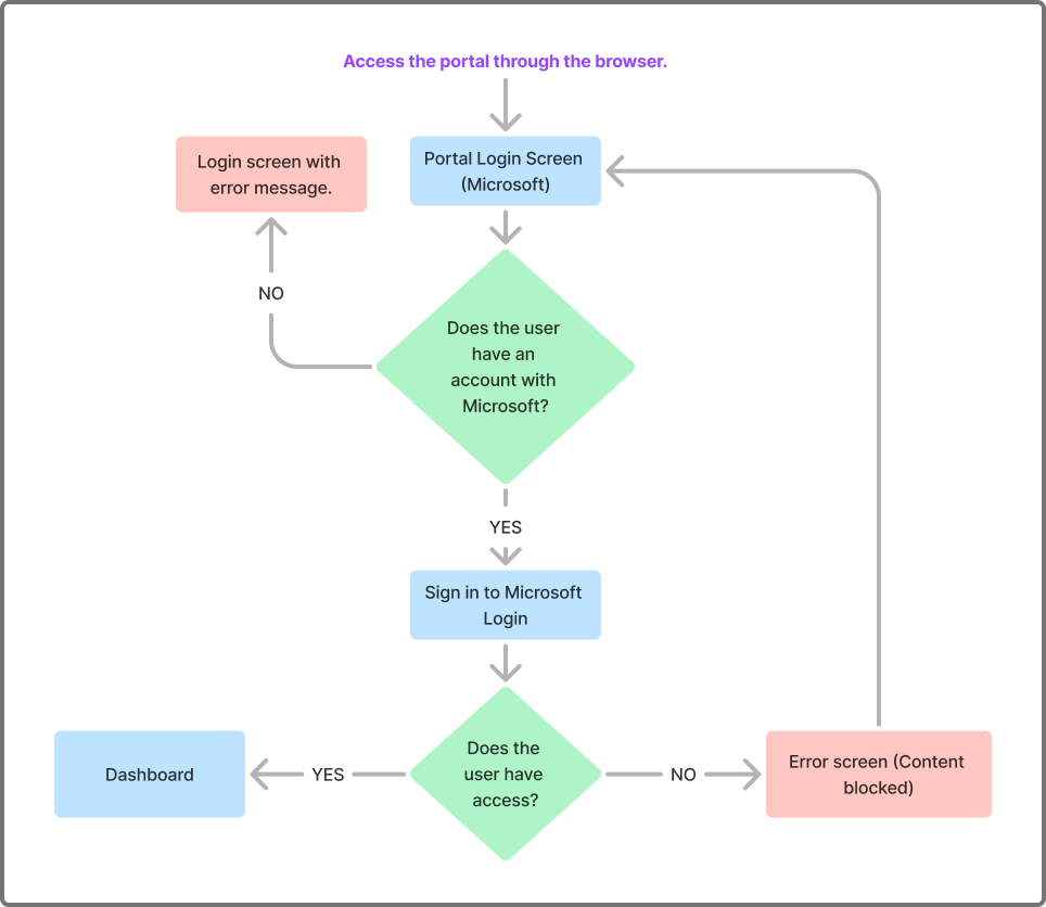
Fluxo estratégico de autenticação e controle de acesso da solução, estruturado para garantir clareza na jornada até o Dashboard.
Defining the tasks
Task definition was carried out in collaboration with stakeholders, aiming to ensure that the analysis reflected real-world usage of the dashboard in an operational context. Core activities were structured around key decision-making scenarios, such as selecting assets under the analyst’s responsibility, interpreting weather conditions presented in the interface, and analyzing precipitation across different timeframes.
Tasks related to navigating and selecting substations and transmission lines within the interactive map were also included, allowing evaluation of visual feedback clarity and interaction flow consistency.
The defined tasks were:
- Selection of assets and substations;
- Interpretation of weather conditions;
- Analysis of precipitation over different periods;
- Navigation and selection of transmission lines.
This set of tasks enabled the identification of critical points in the user journey and highlighted potential friction areas. Based on these findings, it became clear that validating these hypotheses through structured usability testing was essential, ensuring that future decisions would be grounded in real user evidence.
Usability testing
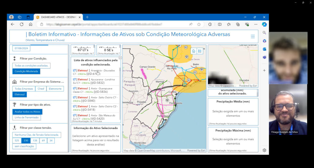
Remote and moderated usability testing, using the Think Aloud Protocol.
Based on the hypotheses identified in the previous phase, six remote moderated usability tests were conducted with operations analysts who used the dashboard in their professional context. The sample included participants with varying levels of experience, tenure, and academic backgrounds, ensuring diverse perspectives and stronger qualitative insights.
The tasks were designed to replicate real decision-making scenarios and were structured as follows:
- Select a specific date and weather condition;
- Select an asset from the corresponding company;
- Report the accumulated rainfall over 30 days for the selected asset;
- Identify which weather events were affecting the asset.
Moderation was conducted in a lightweight manner using the Think Aloud Protocol, enabling quick identification of interface friction, navigation issues, and gaps in users’ understanding of the presented information.
Key findings
The analysis of the usability tests revealed recurring patterns of difficulty related to findability, information hierarchy, readability, and system feedback. Although the features were available, they were not always organized or highlighted in an intuitive way, requiring additional cognitive effort from users.
In several instances, participants showed hesitation when searching for information and uncertainty during navigation, indicating misalignment between the interface structure and users’ mental models. These behaviors highlighted the need for structural improvements in content organization and interaction clarity, aiming to create a more fluid, predictable, and efficient experience in an operational context.
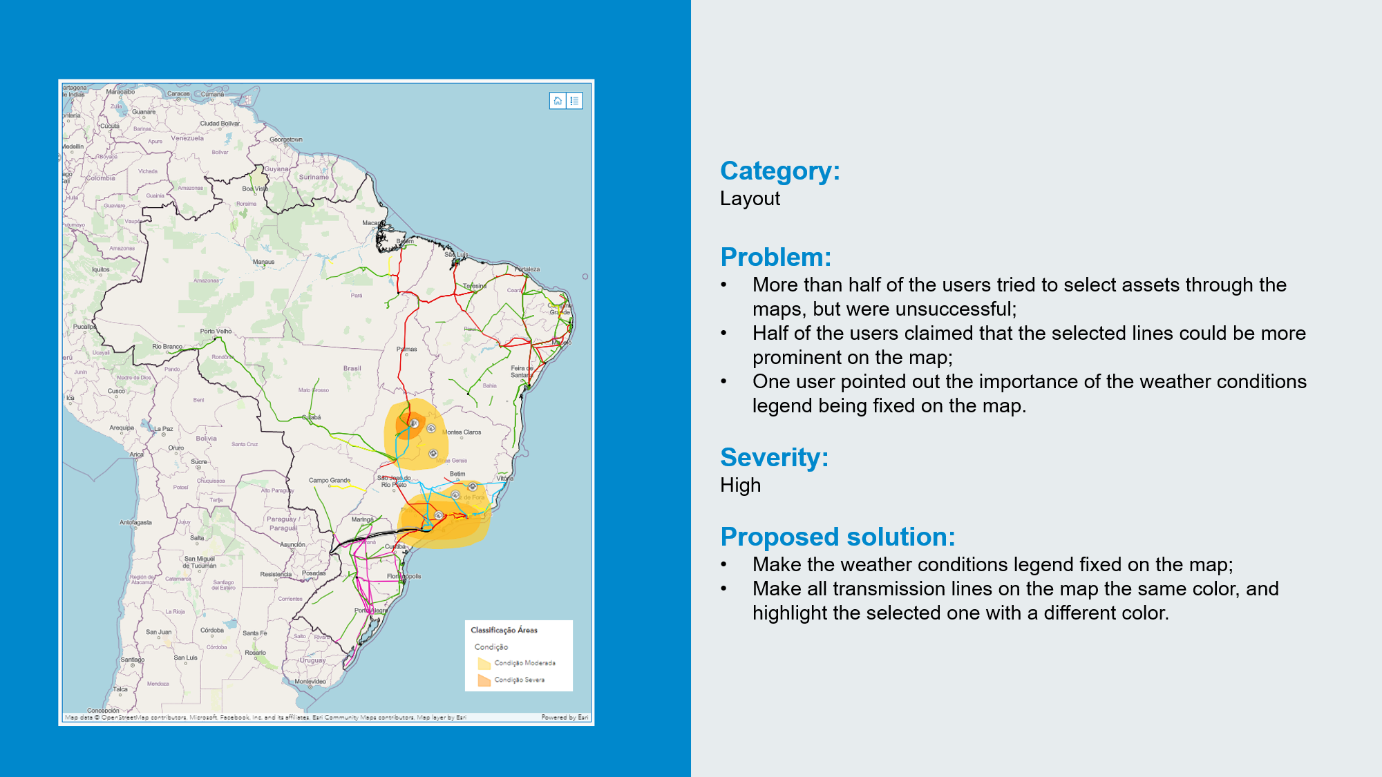
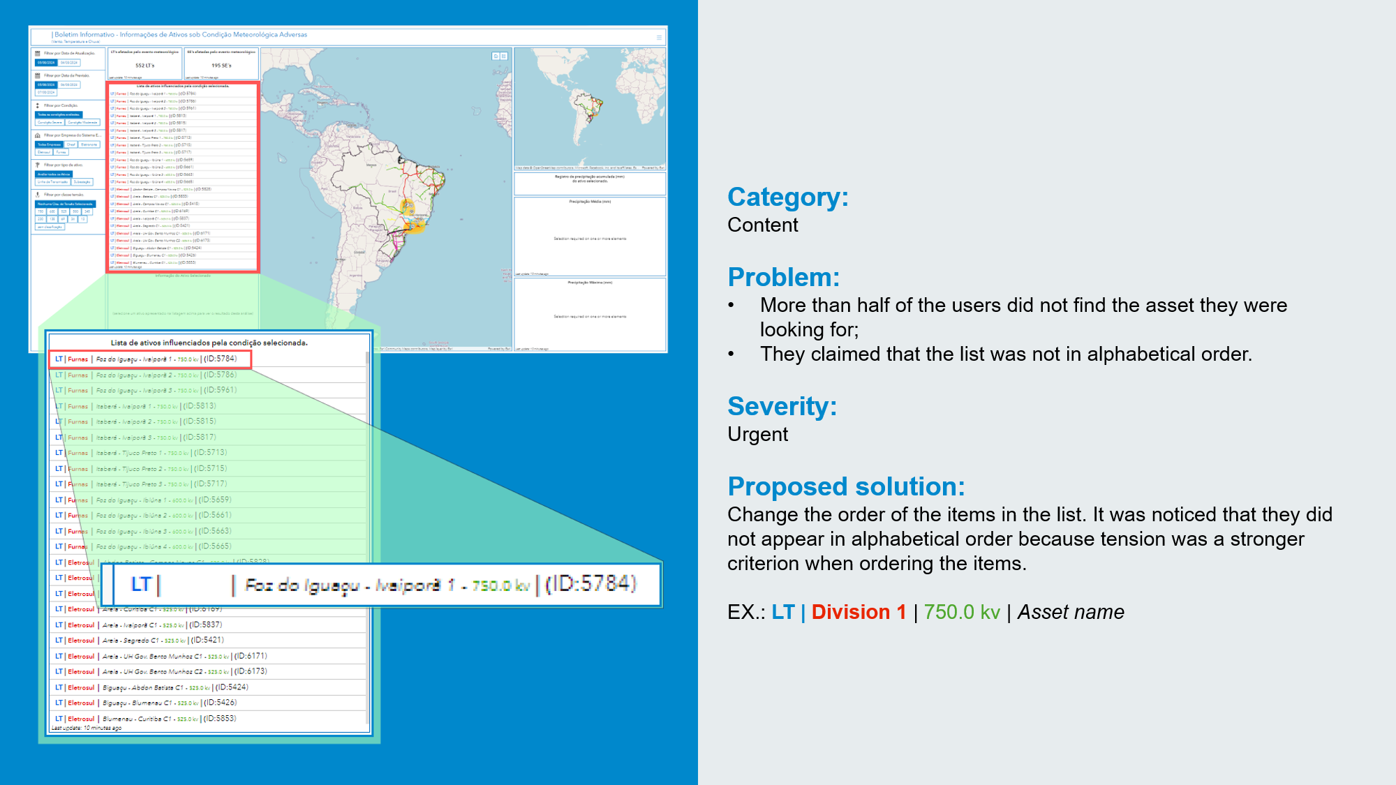
Key issues identified
- Lack of a search mechanism for locating assets;
- Difficulty in finding relevant information within the asset list;
- Visibility and readability issues on smaller screens;
- Ambiguity in interpreting information near chart areas;
- Lack of clarity regarding selection states on the interactive map.
Key UX recommendations
- Implementation of a search field for quick asset discovery;
- Reorganization of information hierarchy within the list;
- Interface adaptation for different screen sizes (responsiveness);
- Revision of chart titles, labels, and layout;
- Enhanced visual feedback on the map, with clear selection states.
Examples of presenting findings and recommendations on user experience and interface.
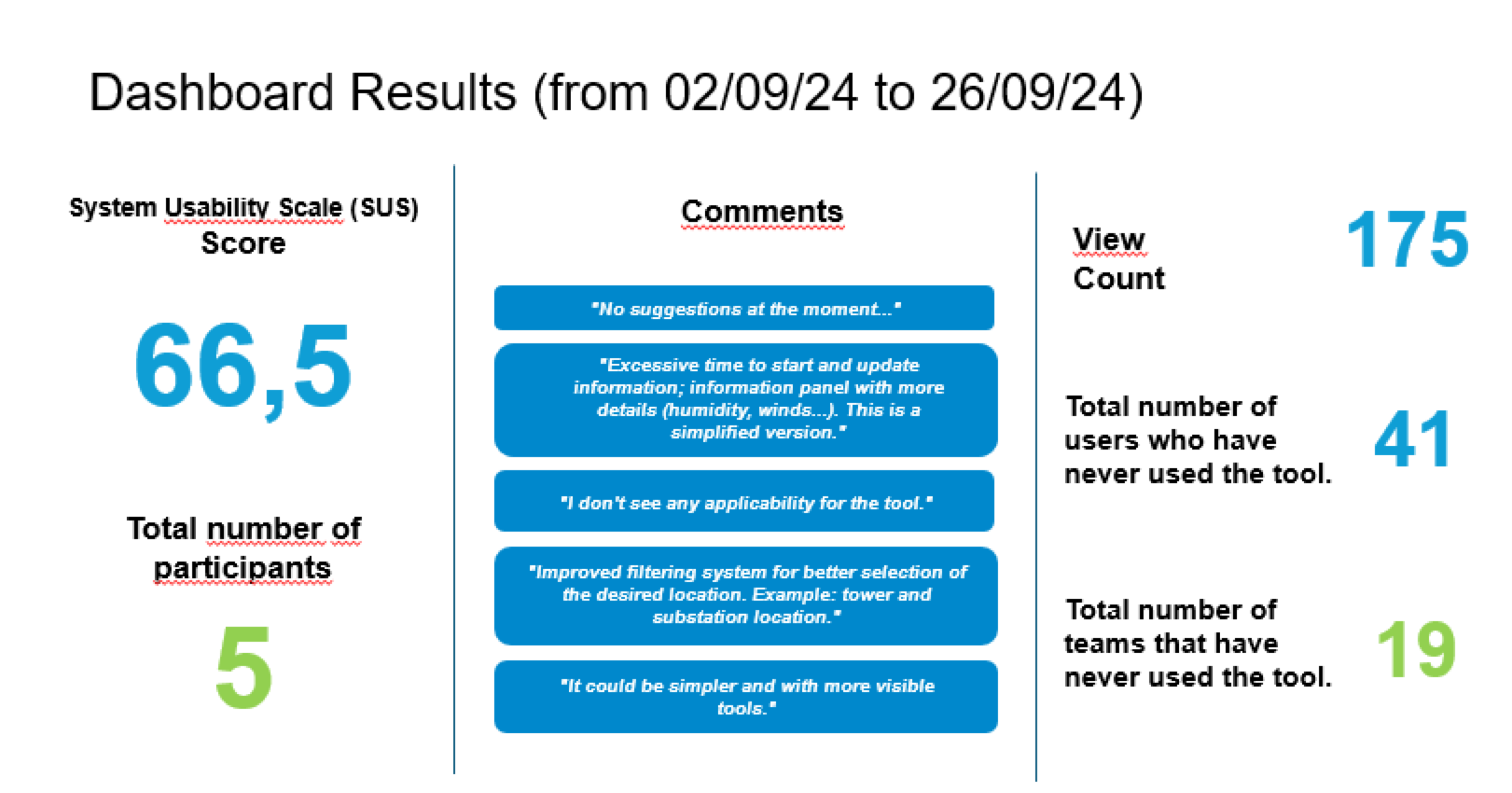
Following the usability tests, the System Usability Scale (SUS) was applied to the same participants in order to complement qualitative insights with a standardized quantitative measure. The scale made it possible to assess the overall perception of usability in a comparable way, providing a synthesized indicator of the experience’s maturity level.
This combination of qualitative analysis and quantitative metrics strengthened the consistency of the findings, supporting more confident prioritization and better-informed product decisions.
Dashboard in 2024 (before the UX process)
Dashboard in 2026 (after the UX process, and still going through iterations)
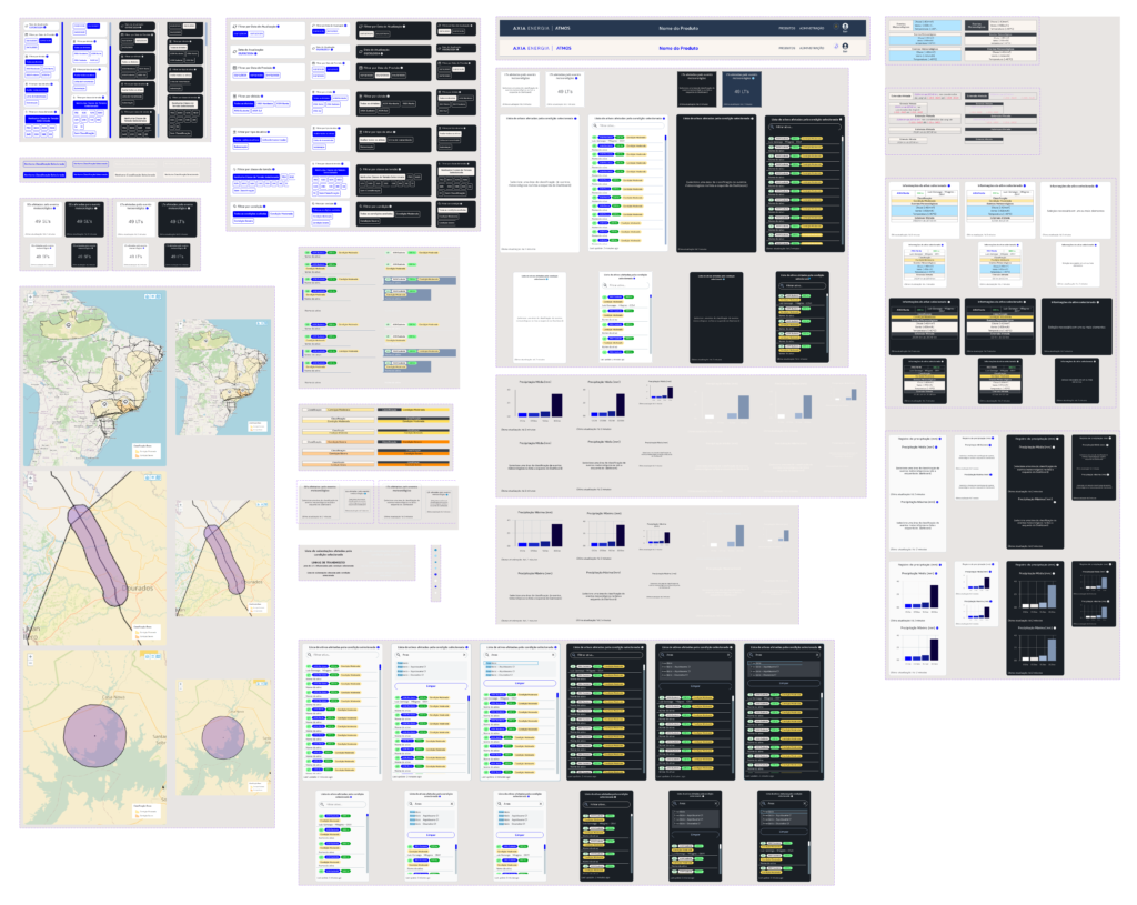
Organization of the main components in Figma
results and conclusions
Impact and outcomes
The prioritized recommendations derived from usability testing were fully implemented by the development team, resulting in structural improvements to the Dashboard’s user experience.
This project marked the first formal application of usability testing within the initiative, establishing an important precedent for the adoption of UX practices in subsequent products. Following this experience, usability testing began to be incorporated into project timelines whenever relevant.
As a result, the Dashboard became one of the main products within the Meteorological Monitoring and Intelligence Center’s portal, reinforcing its role in supporting operational decision-making and its evolution in terms of digital product maturity.
Key learnings
- Introducing UX into products already in use can generate significant impact, even under technical and operational constraints;
- Usability testing in critical systems requires stable and controlled testing environments to ensure consistent results;
- Close collaboration between UX and development accelerates improvements and enhances decision-making quality;
- Usability testing goes beyond interface evaluation, revealing users’ mental models, expectations, and real priorities.
Other Projects

Ratatapp
FATEC Senac Rio

Papelex
Original.io

Clube do Sorvete
Original.io

VTEX Template Store
Original.io